Article: Bedroom Colour Psychology: Choosing Bedding Shades for Better Sleep
Bedroom Colour Psychology: Choosing Bedding Shades for Better Sleep
The colour of your bedding does more than simply complete a bedroom’s look — a genuine body of colour psychology research suggests that colour can meaningfully influence mood, perceived room temperature, and the sense of calm or stimulation a space evokes, all of which have real implications for how relaxed and ready for sleep you feel each night. Choosing bedding colour thoughtfully, rather than purely on trend or aesthetic impulse, can be a genuinely useful part of building a better sleep environment.
Why Colour Affects Mood and Relaxation
Colour psychology, an established area of environmental and behavioural research, generally categorises colours along a spectrum from calming and restful to stimulating and energising. Cooler tones — soft blues, greens and muted greys — are consistently associated with calm, relaxation and reduced perceived stress in the research literature, which is part of why these tones appear so frequently in spaces specifically designed for rest, from spas to hospital recovery rooms to, naturally, bedrooms. Warmer, more saturated tones — bright reds, oranges and vivid yellows — tend to be associated with increased alertness and energy, qualities that are valuable in a home office or kitchen but generally less helpful in a space meant to encourage winding down before sleep.
This does not mean warmer colours have no place in a bedroom, but it does suggest that the dominant colour of large-surface-area items like bedding is worth choosing thoughtfully, given how much visual real estate bedding occupies in most bedrooms.
Sage Green and Its Calming Associations
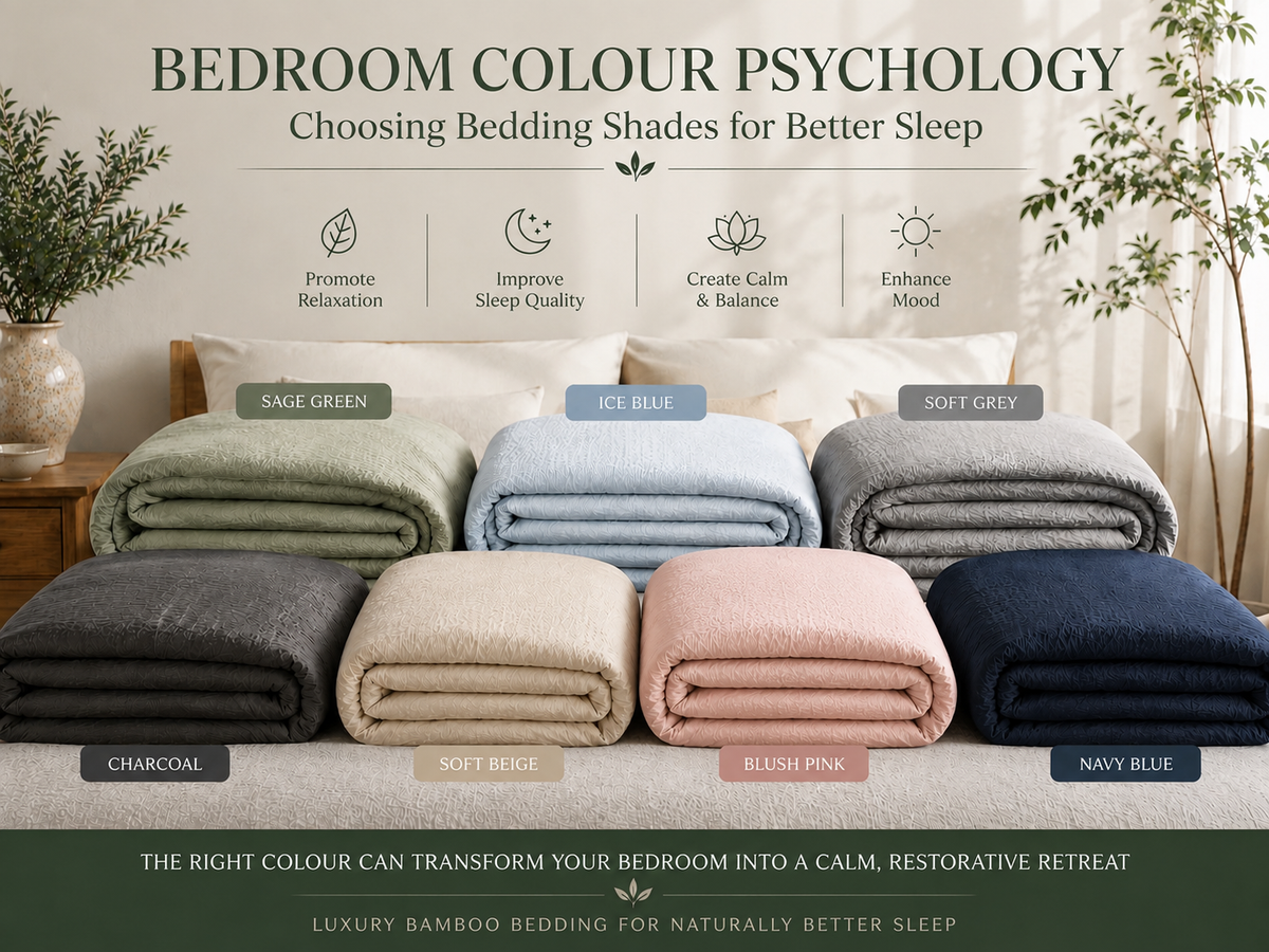
Green tones, and sage green in particular, are strongly associated with nature, tranquility and a sense of calm balance, drawing on humans’ deep-rooted psychological association between green and the natural, restorative environments of forests, meadows and gardens. Sage green in particular offers a softened, muted quality that avoids feeling overly bold or stimulating, making it a genuinely popular choice for bedrooms specifically because it combines this calming natural association with a sophisticated, easy-to-style neutral quality that works well across a range of broader bedroom colour schemes.
Duck Egg Blue and Soft Blues
Blue tones are among the most consistently cited calming colours across colour psychology research, with some studies suggesting blue bedrooms are associated with longer average sleep duration compared with more vividly coloured alternatives. Duck egg blue specifically offers a gentle, slightly green-tinted pale blue that feels fresh and airy without veering into a cold or clinical feeling some more saturated or grey-toned blues can create. This makes it a popular choice for anyone wanting the calming benefits associated with blue tones while maintaining a warm, genuinely inviting bedroom atmosphere.
Soft Grey and Charcoal: Sophisticated Neutrals
Grey tones occupy an interesting middle ground in colour psychology, generally read as calm, sophisticated and understated rather than strongly stimulating or strongly soothing in the way more saturated colours can be. Soft grey works particularly well as a flexible neutral that pairs easily with almost any other colour in a wider bedroom scheme, while charcoal offers a deeper, more grounding tone that many people find creates a genuinely cocooning, restful atmosphere, particularly effective in bedrooms that benefit from a slightly enclosed, intimate feeling rather than a bright, open one.
Warm Neutrals: Ivory and Warm Sand
Warm neutral tones such as ivory and warm sand offer a softer, gentler alternative to stark white, bringing a subtle warmth that many people find more genuinely relaxing than a cooler, more clinical white while still maintaining the light-reflecting, spacious quality neutral tones bring to a bedroom. These tones work particularly well in bedrooms that receive limited natural light, since their warmth helps offset a room’s tendency to feel cold or flat under artificial lighting, while their neutrality keeps the overall look calm rather than visually busy.
Navy and Slate Blue: Depth Without Overstimulation
Deeper blue tones such as navy and slate blue bring genuine depth and a sense of grounded sophistication to a bedroom, while still drawing on blue’s broadly calming psychological associations. These deeper tones work particularly well for anyone who finds very pale, light bedding schemes feel slightly clinical or sparse, offering a more enveloping, cosy atmosphere without introducing the higher-stimulation qualities associated with warmer, more saturated colour choices such as bright reds or oranges.
Blush Pink: Softness Without Overstimulation
Blush pink offers a genuinely interesting middle ground within colour psychology, since pink tones are sometimes associated with warmth, comfort and gentle emotional soothing, distinct from the more strictly “calming” association of blues and greens, while remaining considerably softer and less visually stimulating than bolder, more saturated pink or red tones. This makes a soft blush pink a popular choice for anyone wanting a gentle, comforting bedroom atmosphere with a touch more warmth and personality than a purely neutral or cool-toned scheme offers.
Practical Tips for Choosing Your Bedding Colour
Beyond the psychological associations of specific colours, a few practical considerations help guide a genuinely well-suited choice. Consider your room’s natural light: darker or cooler tones can make a room with limited natural light feel smaller or dimmer, while lighter tones help maximise the sense of space and brightness in these rooms. Consider your existing bedroom furniture and wall colour, aiming for a bedding tone that complements rather than competes with the room’s other dominant colours. Finally, trust your own personal response to a colour alongside the general psychological associations discussed here — while research provides useful general guidance, personal association and preference play a genuine role in how calming or restful any given colour feels to you specifically.
Combining Colours Within a Considered Bedroom Scheme
Few bedrooms rely on a single bedding colour alone, and thinking about how your chosen primary bedding shade combines with walls, curtains, flooring and other soft furnishings matters for the overall calming effect discussed throughout this guide. A general principle worth following is limiting a bedroom’s dominant palette to two or three genuinely complementary tones, generally drawn from the calmer end of the colour spectrum discussed above, rather than introducing an excessive number of competing colours that can undermine the sense of visual calm even if each individual colour would be restful in isolation. Sage green paired with warm sand, or duck egg blue paired with soft grey, are examples of combinations that maintain a coherent, calming overall effect while still introducing enough visual interest to avoid feeling flat or overly minimal.
Seasonal Colour Changes for Your Bedroom
Some people enjoy rotating their bedding colour choice seasonally, mirroring the tog rating adjustments discussed in our dedicated seasonal guide, choosing cooler, fresher tones such as duck egg blue or soft grey for spring and summer, and deeper, warmer tones such as navy or charcoal for autumn and winter. This is entirely a matter of personal preference rather than a strict colour psychology requirement, but it offers a genuinely enjoyable way to keep a bedroom feeling fresh and seasonally attuned throughout the year, while still remaining within the broadly calming colour range this guide recommends for genuinely restful sleep.
Trusting the Process Over Time
Choosing a new bedding colour based on the principles discussed throughout this guide is not something that needs to be perfected immediately — living with a new colour scheme for a few weeks, and paying genuine attention to how it makes you feel each night, is the best way to confirm whether a particular choice is truly working for your own sense of calm and restfulness, beyond what general psychological research alone can predict for any single individual.
Colour Choice for Shared Bedrooms
For shared bedrooms where two people may have genuinely different colour preferences, finding a genuinely mutually calming neutral or muted tone, rather than one partner’s preference simply overriding the other’s, tends to support a more harmoniously shared sense of restfulness for both people. Soft grey and warm sand tend to work particularly well as genuinely neutral compromise choices in this situation, given their broad appeal and calming associations discussed throughout this guide.
In Summary
Choosing bedding colour thoughtfully, informed by genuine psychological principles rather than passing trends alone, is a simple, low-cost step that meaningfully contributes to a bedroom genuinely built for rest rather than simply for appearance.
Frequently Asked Questions
Q1: Is there one single “best” bedding colour for sleep?
Ans: Not definitively — while cooler, muted tones such as sage green, duck egg blue and soft grey are the most consistently associated with calm and relaxation across colour psychology research, personal association and existing bedroom decor also play a genuine role in what feels most restful to you specifically.
Q2: Should I avoid bright, bold colours in my bedroom entirely?
Ans: Not necessarily for the whole room, but for large-surface bedding items specifically, softer, more muted tones are generally more supportive of a calm, restful atmosphere than very bold, highly saturated colours, which are better suited to smaller accent details if you want to incorporate them.
Q3: Can changing my bedding colour actually improve my sleep quality?
Ans: While bedding colour alone is unlikely to resolve significant sleep problems, choosing calming, restful tones as part of a wider considered sleep environment — alongside factors like temperature, breathable fabric and a consistent bedtime routine — can genuinely contribute to a more relaxing overall atmosphere conducive to better sleep.
Choosing your bedding colour thoughtfully, informed by both established colour psychology principles and your own personal sense of calm, is a simple but genuinely worthwhile step in building a bedroom that actively supports rather than works against restful sleep.